06-23-2026
Reading time: 8 min
An exclusive interview with the Clear Case R&D team. Behind the transparency lies RHINOSHIELD's long-term commitment to refusing compromise.
06-23-2026
Reading time: 8 min
For RHINOSHIELD, transparency is never just about what you "see." It symbolizes our unwavering pursuit of honesty and purity. While 99% of clear cases on the market tolerate "yellowing," we chose the hardest, slower path. This path ultimately defined a new standard for clear cases. Following our initial Clear Case R&D story, we now invite the product design team to discuss this four-year "long run of no compromise," revealing the technical choices and value persistence behind the Lifetime Anti-Yellowing Warranty.
Q: Looking back at the start of the Clear project, solving the "yellowing" problem—a challenge the industry had deemed acceptable—was clearly a formidable task. What conviction and drive propelled the RHINOSHIELD team to challenge and change this status quo?
Designer Ronald: Honestly, the failure of PlayProof became our turning point for determined anti-yellowing efforts. Before Clear, we released a transparent case under the PlayProof line, which, like every product on the market, eventually yellowed. When we saw our own product turn yellow, we realized it was a "pseudo-transparent" product with an expiry date, violating our commitment to the product's essence: "transparency."
Yellowing is not just the physical degradation of material; it's a compromise of consumer trust. Our product team could not accept this "pseudo-transparent" product. Therefore, we believed that if RHINOSHIELD were to re-enter transparent case R&D, we had to set "anti-yellowing" as the highest and non-negotiable standard for the product definition, otherwise, there would be no need to launch it.
Designer Fee: "Transparency" symbolizes purity, honesty, and the essence of design. We want consumers to see the original design aesthetic of their phones through the case, not have it covered by a yellow filter. From a designer's perspective, that added yellow shadow deducts from the phone's texture and design language, which we are unwilling and unable to tolerate. As designers, we have a responsibility to fully realize this pure transparent beauty. It was this conviction for "truly pure transparency" that prompted us to commit fully to R&D in 2018, defining a new transparent standard for the market.

Q: It took until 2022 to officially launch the fully anti-yellowing clear case. What were the most challenging technical or developmental obstacles encountered during that period?
Designer Ronald: Typically, clear cases on the market use a multiple-material design—a TPU frame with a PC backplate. This method is mature, dimensionally stable, and easier to mass-produce and sell. However, this "easy path" has undeniable drawbacks: TPU material easily yellows, PC backplates contain Bisphenol A (BPA), and multiple-material products are significantly harder to recycle. Therefore, to simultaneously achieve the three conditions of "Mono-material, Anti-Yellowing, and BPA-Free," we had to fundamentally rethink material selection and product design processes. The condition of the 1+1+1 Technical Iron Triangle significantly extended the product line's development.
Q: Ronald mentioned that anti-yellowing and BPA-Free were the two initial hurdles. What conviction drove the product team to raise the challenge and include "Mono-material" as the fundamental development standard? Did this pose significant resistance in manufacturing?
Designer Fee: Our goal was never just to create a case that wouldn't yellow; we were pursuing ultimate aesthetic purity and environmental responsibility.
First, Pure Design: The soft/hard material splicing of multiple-material cases on the market inevitably creates seams or gaps, disrupting the visual integrity. To achieve our desired "seamless, dotless, water ripple-free" extreme transparency, we knew the unified, mono-material approach was the only answer and the only solution we were looking for. When we found that high-spec, medical-grade material, we resolutely set the single-material standard because design tolerates no seams.
However, this decision created immense resistance in the manufacturing process. Achieving a truly seamless clear case required extreme effort in mold development, pushing the limits of the industry. We spent a great deal of time negotiating and adjusting with partners, even needing to find those who shared our conviction, to finally turn the persistence for "flawless transparency" into reality.
Furthermore, the more crucial aspect is Sustainability Responsibility: Dual-material products are complex and extremely difficult to recycle, which contradicts our mission to reduce virgin plastic waste. Therefore, adhering to the single-material bottom line from the source is our steadfast commitment to environmental ethics. Although we successfully established the "Mono-material" standard, the real challenge was just beginning.

Q: Under the strict premise of "Mono-material" persistence, what was the most difficult technical hurdle the team faced over those four years?
Designer Fee: After setting the single-material standard, we quickly realized it brought forth an unprecedented technical black hole. Every step, from material research to manufacturing, was a limit-pushing challenge. To satisfy both high protection and BPA-Free standards, our initially attempted materials were quickly eliminated as they easily broke during drop tests. Our previous materials faced dimensional stability issues in structural design, often showing surface imperfections during the injection molding process.
The turning point came from a bold attempt: Although we had developed some feasible prototypes, which, while not meeting the single-material threshold, achieved expected quality and transparency, our founder Eric brought back a brand-new medical-grade transparent material and asked the team to test this high-cost material. Every designer felt immense pressure adopting and testing this material, yet simultaneously saw its potential for extreme, single-material transparency. Despite the unknown risks, we were all filled with anticipation for its birth.
But the challenge was just beginning. This brand-new material completely shattered our past mastery of products and materials. We had to re-learn and understand the material's characteristics and use our professional expertise to adjust it into a stable manufacturing process. Every material change and mold adjustment was like re-developing a brand-new product. The team had to invest immense time in repeated testing and high-spec validation to truly overcome the material's challenges, ensuring the case could stably enclose the phone long-term.
Ultimately, it was this persistence for perfection that allowed us to successfully apply this dimensionally stable, recyclable, BPA/F/S-free single, medical-grade material. Clear is not just a clear case; it's the realization of a "transparent choice" where transparency, protection, and sustainability coexist.
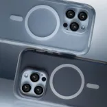
Q: In pursuing ultimate transparency, Clear achieved a "seamless, dotless, water ripple-free" surface. Why did the design team insist on avoiding the common "internal dot matrix" design seen in the market? What was the biggest craftsmanship challenge behind this?
Designer Ronald: This was the hardest path we chose in aesthetic craftsmanship. The micro-dot matrix seen on market clear cases is a compromise—it's used to prevent air bubbles or unsightly "watermarks" from forming when the phone back and case surface fully adhere. However, we believe that true, flawless transparency should not rely on dots to mask defects. Our pursuit of pure visual clarity meant we had to solve the problem fundamentally.
This required us to use the highly sensitive Mono-material, combined with high-precision molds and process control, to ensure the internal surface of the case was completely smooth while precisely managing material thickness and tolerance. This approach allowed us to permanently eliminate watermarks without sacrificing clarity, giving consumers a truly clean, pure transparent experience. This is our dedication to "authentic transparency."

Q: During the development process, did the team ever consider compromising or rushing the launch? What conviction kept you going?
Designer Ronald: For the team, the biggest challenge wasn't technology; it was mindset. We knew the path of no compromise was difficult, and as long as there was room for improvement, we wouldn't hand it over to the marketing team for launch. Fee even shed tears when progress fell behind expectations, but I also watched them wipe them away and continue sketching and testing materials. Going through these challenges together made the team even more united.
The consensus at the beginning was simple: "Success is the only option." For us, the Clear Case had to be a product that all internal colleagues could confidently declare "will absolutely not yellow" to the public. But this confidence took years to temper and refine.
Today, Clear is more than just a choice in the clear case market; it's RHINOSHIELD's answer to the user: "Even if it takes four years, we will prove that transparency can be protective, authentic, and align with our product development principles."

Q: Although the clear case market seems to have reached a product design saturation point, with various brands launching colored clear cases, what would you most like to improve if there's a chance to release the next generation of Clear?
Designer Ronald: I think "lightness" and "protection" are perhaps the next biggest incentives to attract users. How to achieve a lightweight look, both physically and visually, is the design direction we are currently striving for. You can anticipate a more evolved Clear version in the near future!
Q: After a four-year long run of no compromise, we launched the industry-rare "Lifetime Anti-Yellowing Warranty." What does this bold commitment truly mean for the RHINOSHIELD brand and R&D? What value do you most hope users feel every day when they use the Clear Case?
Designer Ronald: For us, the "Lifetime Anti-Yellowing Warranty" is certainly not a marketing slogan; it's the practicality of our four years of technical foundation and financial commitment. It signifies that we believe in scientific validation, we believe the team's choice in product material and manufacturing process is sound, and we believe our conviction to maintain the highest standards is worthwhile. This warranty is our Technical Confidence Certificate; it tells consumers: we believe Clear's anti-yellowing performance in the clear case market is sufficient to become the new industry benchmark.
Designer Fee: What I most hope consumers feel is the "freedom of choice." In the past, users were forced to compromise, choosing between "transparent" or "non-yellowing." Now, we hope this product allows them to experience true purity—they can safely and permanently showcase their phone's design aesthetic. Clear doesn't just protect your phone; it protects your right to choose. This long-lasting transparency and purity is the value we wish to convey.
Every detail of Clear is a symbol of our refusal to choose the easy path and our refusal to compromise on persistence—and this is the absolute foundation of our Lifetime Anti-Yellowing promise.


Product Design
Reading time: 3 min

Product Design
Reading time: 5 min

Plastic Management
Reading time: 5 min